Daily UI Design Challenges
Daily UI is a series of design challenges users can subscribe to, in order to hone their UI abilities. Users are sent a prompt each day, where they are tasked with building a particular interface. The design, device, and outcome are up for interpretation.
Numbers signify the corresponding challenge in the series.
Sign Up Page
Shown are two versions of the same screen. This was my first attempt at the Daily UI Challenge. The prompt was a sign-up page, so I got the idea of a daily workout challenge, similar to that of the Daily UI challenge. When I input the images, the change from color background to the image itself was too abrupt. So I put a gradient, which mellowed the transition.
I wanted these designs to utilize only one color each—not including the standard use of white. I chose purple and orange. I think orange works particularly well with the image in the second screen. As for the ‘Get Started!’ button, I used a lighter version of each main color to differentiate the Call-to-Action from the rest of the page.
3. Landing Page
This is actually one of my later works. I wasn’t content with the earlier work, so revisited the task weeks later. I recently learned the technique of making the background a very blurred image, so I wanted to incorporate it.
For this entry, was aiming for vibrancy: I selected an image as my background that was filled with color. I made it just blurry enough that you could still tell the picture is a concert, but the scene itself would not distract the user.
In juxtaposition, the video is far more tame visually. I knew a video with a thumbnail of bright colors would create far too much contrast when put atop the current background. In line with this, the column to the left is plain white. This helps create order on the page, and divide the site by its content. Here is where users can find a pivotal link: Sign In.
4. Calculator
I had two aims for the Calculator: An appropriate font and a fitting color palette. There really isn’t much else to calculators. The font needed to be rigid—to be pretty linear—like that of calculators we know. What really sold me for the typography was the zero. It looked exactly like what I had in mind. As for the colors, I wanted a more muted array of hues. Calculators aren’t exactly known to have fun colors.
There are two features to highlight. Calculators on the cell phone don’t offer many buttons when in a vertical orientation. A feature I had in mind was holding down a button to reveal more options. This action affords the user more flexibility. Additionally, users can see their previous inputs. The log helps users track their calculations.
6. User Profile
It’s been nearly two years since I’ve touched a dating app. I didn’t like them much. I created a simple design incorporating what I found good about each interface.
Tinder has a simple design, and easy interface to navigate. However, profiles are so formless and generally lack content. Hinge provides users with questions to encourage self-disclosure. I combined the best of both into what you see above.
9. Music Player
This is the design where I actually felt the tides turn for myself. I was super proud of the design and the work that went into it. As I said before, I didn’t really have a foundation in UI design. But the end-product was very clean.
One element that I would like to mention is the top portion of the screen, specifically the background behind the album covers. Originally, the background was a solid sky blue. But when I changed the background to a gradient, the music player felt a lot more alive. This showed me the power of a good gradient. The background is currently blue, but I envision it to change with the color scheme of the song’s image. For example, the next track would introduce a light orange gradient to the screen. This creates a more dynamic, visually appealing platform.
11. Failure & Success Messages
This prompt was pretty interesting. Users would receive a success and failure message from a task they attempted. Other submissions I referenced played around with the concept of a good and bad outcome. For example, I remember seeing a submission with an ice cream cone. One looked great with strawberry ice cream and sprinkles; the other was the same cone but sadly smushed on the ground. I wanted to capture that same idea of two opposite outcomes.
The illustrations on the screens above were derived from one image. The image was just altered in Photoshop to fit the alternate screens. In the first, you can see the basketball completely missing the hoop—Airball! In the other, the ball has cleanly entered the hoop. I kept the color scheme simple, only using tones of red and green (minus the net). As we know, these colors are commonly associated with failure and success, respectively.
14. Countdown Timer
For this prompt, I didn’t just want to show a single screen of the timer at work. I wanted to design the countdown as well as the set up.
The set up is pretty familiar for users. Users can select the specific time they want to wait out, in hours, minutes, and seconds. As for the timer itself, I wanted to incorporate a colorful component. The progress bar is shaped and colored like a rainbow, contrasting the indigo background. The color of the time displayed also changes to reflect the current color of the progress bar.
15. On/ Off Screens
I had a lot of fun with this prompt. Participants were tasked with developing an On/ Off switch, so I decided to tackle an alarm. UX-wise it isn’t the most functional. But that isn’t the point of these exercises.
This was also a personal milestone UI design in my eyes. Every element you see within the phone screens was handmade by myself: From the clouds, to the emojis, to the subtle rays of sunshine, to the little sleeping cap. The design is charmingly ‘emoji’, and one that I’m very proud of.
16. Pop-Up Overlay
In contrast to the previous screen, this prompt took no time at all. In my mind, pop-ups within a platform should succinctly communicate something to the user. I wanted the design to be simple and clean. I wanted to illustrate a message sent—a paper plane conveys the idea of travel. Namely, Jackie’s inbox successfully received the message.
18. Analytics Page
Many of those who diet are familiar with achieving certain levels of macronutrients. For example, those on the Keto diet aim for carbs to make up only ~10% of their daily caloric intake. As someone currently on a diet, I wanted to try my hands at the graphic.
The biggest challenge was fitting all the information users would find relevant without overloading the screen. I wanted to include a large image at the top informing the user of their total calories consumed; this is highly important information for weight loss. The circle breaks down the user’s macronutrients and calories for the day, each macro denoted by a different color. Below that, users can find graphics that detail their goals for the three macronutrients.
I also wanted to experiment with the concept of exceeding one’s limit. As you can see, the user has eaten too many carbs—those berries probably didn’t help. I try to catch the user’s attention of this excess in two ways. In the carbs chart, the meter has begun to eclipse itself, in a darker green than the one beneath it. Secondly, the percentage and grams count are both slightly red, as opposed to the usual white, alerting the user.
19. Leaderboard
When I read the prompt, I was really excited to attempt this design. Immediately my mind went to utilizing the colors of gold, silver, and bronze, the traditional symbols for first, second, and third place. I pictured an app played among friends, where users could see how they fared against their peers. In this case, the design needed to seem interactive and fun.
The upper half of the screen contains the top scorers of the group. Their hierarchy within the group and to each other is visually communicated by the color of their border, the size of their bubbles, and placement relative to each other.
The lower half of the screen displays all the players. The top three players have gold, silver, and bronze respectively. Beyond that, all users simply have blue highlights. That is, except for the user, whose box possesses the inverted color scheme of white lettering on a dark surface.
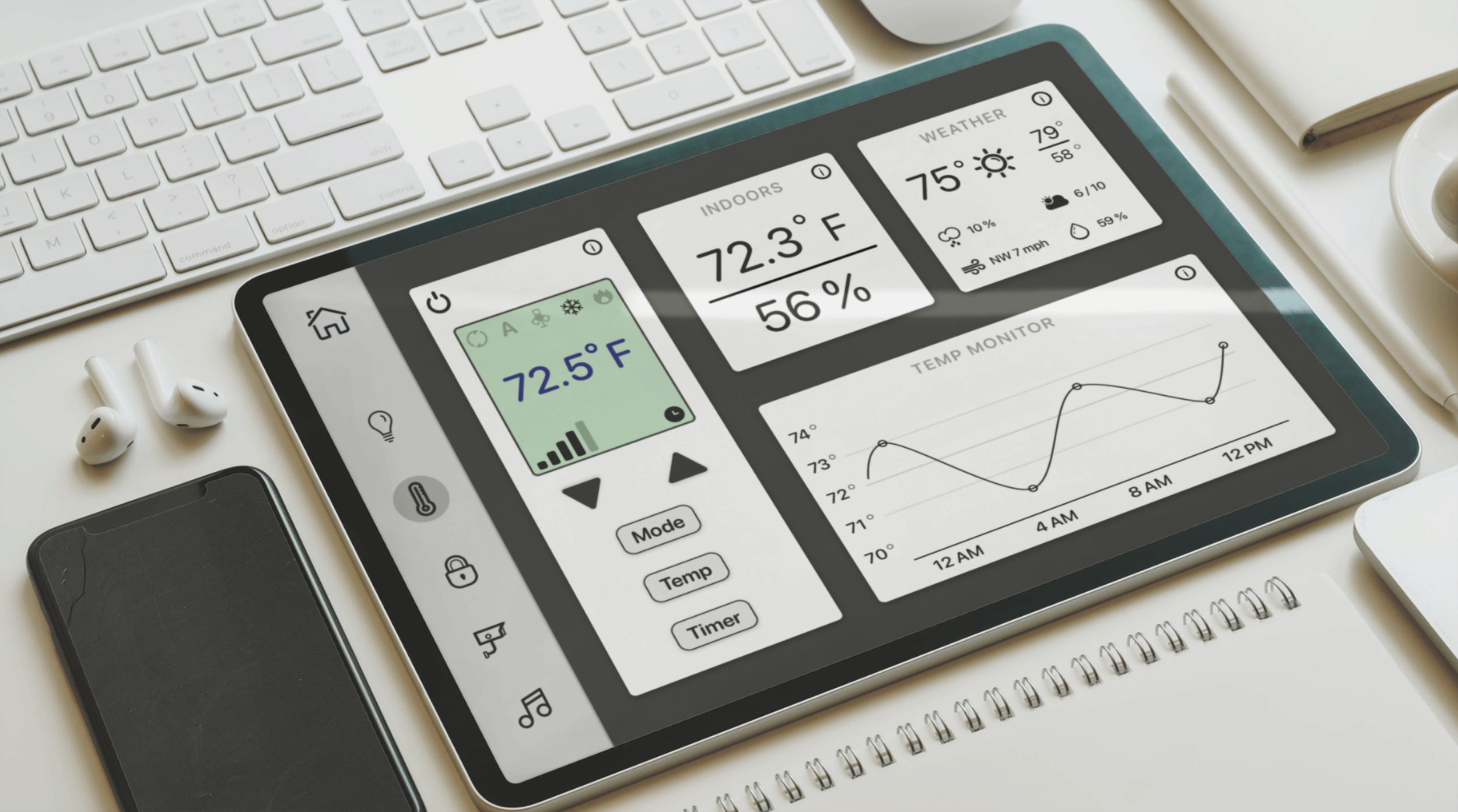
21. Monitoring Dashboard
When I pictured this prompt in my head, I imagined a minimalist interface, like that of existing home monitoring systems you’d find attached to the wall. The primary purpose of these platforms is to regulate your home. I wanted a no-frills interface that was arranged orderly and cleanly communicated information to the user.
The major colors within the interface are white, light gray, and dark gray. The only exceptions are the slight green hue of the Central Air remote’s screen— which is reminiscent of screens on the physical form—and the blue temperature reading of the remote, to denote cooling.
23. Onboarding
When I read that this challenge’s theme was onboarding, I instantly knew my direction. Onboardings usually follow a set guideline of three or four screens that highlight the key features of a product: They have a picture in the center that illustrates the feature, a brief description, and small progress indicators on the bottom of the screen. It was these small indicators that I wanted to focus on. Obviously, all of the above are important, but the UI Challenges are a time to explore fun ideas. I set my mind on checkboxes—another screen in the onboarding would mean the next box ticked for the user. For this concept, what better platform than a To-Do list? Furthermore, onboardings are treated like a sequence. As an additional embellishment, a light green wave behind each illustration helps to create a sense of continuity among the screens.
For this prompt, the focus is really more on the finer details. They help establish an immersive atmosphere for the user.
24. Boarding Pass
Similar to other screens, the greatest challenge of the Boarding Pass was fitting so much information in a small area in a comprehensible manner. I also wanted to include a map of the origin and destination cities. Omitting this image was out of the question.
I really had to consider the arrangement of information: Which details could I group together in a way that made sense for the passenger? Ultimately, it came down to the flight itself, the time, the passenger, and the location. The categories aren’t perfect because some details overlap, but they make the information digestible for the user.
The flight section tells the airports involved, the departure and arrival specifics, the flight number, and the trip’s duration. The time section tells the date and boarding time. The passenger sector displays the person’s name and the boarding group they belong to. Lastly, the location shows the terminal, gate, and seat on the plane. On the very bottom is the stub, where attendants scan for passengers’ entry.
26. Subscribe
This was actually my third screen attempt at the prompt. The first looked way too generic; the second attempt just seemed incomplete. I was satisfied with my third try.
The landing page of the Daily UI Challenge really stuck with me. For a program that encouraged wondrous designs, the page was so uncomplicated and minimalist. I resolved to make something of a similar vibe. The layout for this is really just two parts: An simple image and a location to subscribe. There isn’t much else to it.
I really like the distribution of yellow and white in this screen. The left half is mostly yellow, but has a good portion of white. The right half is the inverse. The screen is almost like a Yin-Yang, where the two opposites also serve as complements.
28. Contact Form
This is perhaps the least practical of my works, but one of my most inventive.
When I read the prompt, I racked my brain for fun ways to depict a Contact Us form. I had the idea of making the form itself replicate a real-life item. I came up with an envelope, so I just tied the form to USPS.
The top left corner of the envelope contains the entry fields for the users’ name, email address, and subject of the message; on a physical envelope, this is the area where the sender would write his/ her information. In the center, where the desired recipient would go, is instead a message field. Users can write their message to USPS here.
To differentiate the envelope from the white background, I gave the envelope a beige tint, as well as a shadow to lift it off the page. The stamp and blue and red stripes were included to adorn the otherwise bland envelope.
30. Pricing
In pricing screens, there are usually a few tiers, each offering more than the previous. For me, the focus of the screens would be the images on top. I wanted to portray the increasing scale of the product levels through visual representation.
The lowest level—meant for one person—is depicted by a kayak. The next two—Team and Business—are interpreted as a Sailboat and a Yacht. I couldn’t find a cruise ship icon. I like these screens because they are simple, but the illustrations go well with the plans below and help promote the theme of levels.
31. File Upload
The prompt asked participants to create a File Uploading element. I figured this would be best suited for either a tablet or a laptop. Ultimately I went with a tablet.
I decided the feature should have a drag-and-drop location, a common heuristic among file upload programs. What I wanted to explore most was the different results of trying to upload a file. I included three: A failed upload, an upload-in-progress, and a successful upload. Users can easily recognize the status of uploads. The progress bar indicates how far along the uploads are; icons to the left of the bars specify the status of each document.
32. Crowdfunding Campaign
As I’ve alluded to before, sometimes the difficult part is not creating an aesthetic design, but rather finding a way to neatly fit all pertinent information on-screen. I struggled here for this reason. In the design above, there are three sections: The image, the description, and the contribution details. For a while, I was struggling to proportionately allot space to each section. This is particularly difficult when I am limited to the visible portion of the screen, and cannot extend beyond that. Nonetheless, including all three sections was an absolute necessity.
The image’s size was not easily adjustable. Thus, I had to devote my efforts then to the other two sections. I ultimately solved my concern with space by making the contribution details section more compact. Additionally, I had to include an appropriately-sized description. I made words trail off to conserve space, while also indicating that there is more to read; if users are interested, they can click the arrow icon below the description to expand the section and find out more about the item.
Reflections
I found the Daily UI challenges to be invaluable. My UI skills were lacking when I started these prompts. My abilities aren’t exactly impeccable now, but I certainly improved along the way.
I really enjoyed my time on the various challenges. I remember days when I woke up excited to tackle the prompt I read the night before. It was interesting to see how I chose to manifest each design. I am proud not only of the designs you see, but also of my work ethic behind the UI challenges. Although I’ve stopped at challenge thirty-something for now, I fully intend to take a crack at some more in the future.
Tools:
Sketch, Photoshop, Artboard Studio