
Dashcard
Context
Students rely on a number of resources to study and absorb what is taught in school. They must compile the vast amount of information given to them, and review it in a way that promotes retention. Among the most popular approaches to studying is flashcards, but this method seems to have few viable choices and apparent constraints.
Dashcard recognizes the limitations of flashcards and works to support students in their studies and to accelerate learning.
Problem Statement:
How might one design a mobile app that empowers people to learn new vocabulary?
Mission:
Develop a flashcard app that users will actually be excited to use!
Roles:
User Researcher, UX Designer, UI Designer
My Design Approach
I employed a Design Thinking approach to advance the development of my flashcard app.
Empathize
Seek other flashcard apps and analyze the competitors. Identify the advantages and disadvantages of each platform, and learn from my observations.
Talk to people within the platform’s demographic. Get an idea of the traits and needs of my users. What do they think about flashcards? What do they wish for?
Define
Compile what I’ve learned through the interviews and identify commonalities between users. Develop a persona who encompasses my audience and represents the typical user.
Prototyping
Construct wireframes of key features for the app in a pencil-and-paper model. Take pictures of the wireframes. Use Marvel to build a low-fidelity prototype by connecting screens with clickable ‘hot spots’.
Months later, I would revisit my designs and convert them into higher-fidelity models.
Ideate
Consider the platform’s Information Architecture: How should the app be structured? Perform Task Analyses to explore possible routes for users to complete essential actions.
Testing
Recruit participants within the platform’s demographic and conduct Usability Tests. Assign tasks for the users to attempt. Summarize findings and make necessary revisions to the platform.
Empathize
Competitive Analysis
I performed a competitive analysis of four flashcard vocabulary apps. All apps were well-rated with a high number of reviews, indicating they had a large user population. I adopted the mentality of a student when inspecting the platforms.
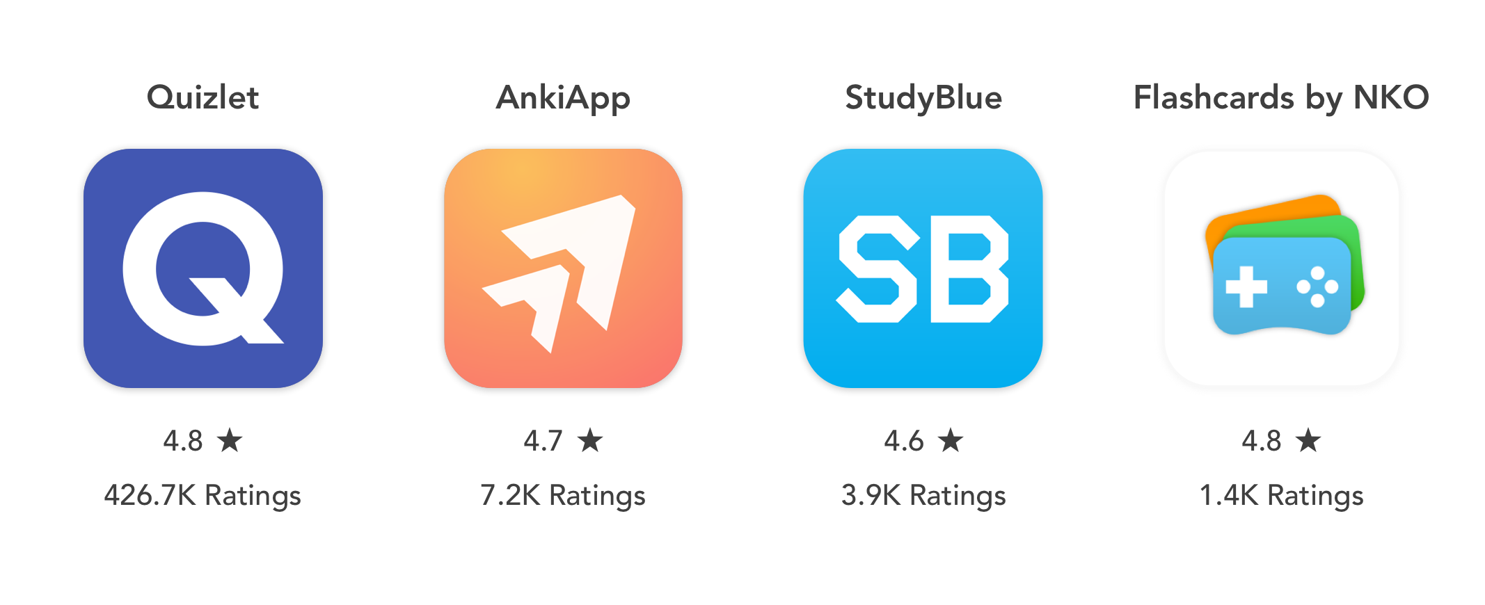
My Objectives for the Competitive Analysis were:
How is the card creation process made intuitive?
How do users launch and conduct study sessions?
Are there features that help users achieve their goals?
What are the weak points within the flows?
And the key insights I found were:
User Interviews
I performed Competitive Analyses, but more research still had to be done. I reached out to people within the platform’s demographic for interviews.
My two goals for the interviews:
What are users’ study habits?
What are users’ views on flashcards?
Users & Quotes
I recruited four users to interview for the Flashcard app. All were within the platform’s demographic and still enrolled in academic settings.
“I’m always looking to not only work hard, but smart too”
“I would like something convenient, to learn quicker and save time”
“Flashcards don’t provide everything needed; they are better for definitions than they are for concepts”
“The usefulness of flashcards really depends on the subject you study”
“When I learn vocabulary, I learn primarily through repetition”
Interview Insights:
I noted observations as well as the challenges users face when using flashcards.
I needed to leverage the strength of flashcards—the benefit of repetition—while also addressing the weaknesses of the study method. That is, I wanted to broaden their usability across subjects and expand the number of scenarios in which they are suitable.
Define
Persona
I reviewed my notes and insights gathered from the user interviews and developed a persona based on the input of my interviewees.
Grace is a compilation of the common attributes of my users.
Problem Statement:
Grace, a dedicated college student, needs a way to efficiently review and learn her course material because she wants to excel in school.
Hypothesis Statement:
I believed that by creating an app for Grace that is easily accessible, utilizes an efficient method of learning, collaborative, and allows users to personalize their studies, we will achieve Grace’s goals of using her time efficiently and excelling in school.
Ideate
With a persona established and her goals identified, I then performed Task Analyses. The exercise helped me explore the possible Information Architecture of the platform. With this, I could discern how to structure the information and features of the app.
Task Analysis: Create New Deck
Entry Point: Open App
Step 1: Select ‘My Decks’
Step 2: Press ‘Create Deck +’ to begin
Step 3: User types in deck’s information
Step 4: User verifies information
If correct, next step
If incorrect, return to Step 3
Success: User presses ‘Save’
Task Analysis: Add New Card
Entry Point: Open App
Step 1: Select ‘My Decks’
Step 2: Choose desired deck
Step 3: Click ‘Add Card +’
Step 4: Tap on first side of flashcard
Step 5: User edits ‘Front’ card
Step 6: User edits ‘Back’ card
Step 7: Insert hint?
If Yes, Step 8
If No, Success step
Step 8: Enter card’s hint
Success: User saves card
Task Analysis: Start a Study Session
Entry Point: Open App
Step 1: Select ‘My Decks’
Step 2: Choose desired deck
Step 3: Click on ‘Study’ icon
Step 4: Select wanted review method
Step 5: Select number of cards
Step 6: User presses ‘Start’
Success: Study session begins
Prototype
Lo-Fi Wireframes
I brainstormed Task Analyses, considering the possible layout of the platform. I felt like I had a good grasp of the app’s architecture. I was satisfied with the work thus far so I moved on, turning ideas into reality.
I converted the wireframes above into a functional prototype using the Marvel app. Images were connected by inserting clickable hotspots between the drawings.
With a prototype constructed, it was time to evaluate my designs in Usability Tests.
Test
Test Plan
Scope:
Test the prototype for the flashcard app. Assign users a series of tasks and monitor performance to assess the platform.
Sessions:
Meet with participants in person. Enlist four participants for sessions of approximately 10 minutes.
Equipment:
Participants utilized the researcher’s phone to access the prototype. The researcher observes users and takes notes during each test.
Tasks:
Users were given five tasks, in the form of Scenario tasks, where users were given context for completing each. The order of tasks is below:
Create a new deck
Create a new card for a deck
Begin a study session
Check your stats on the deck
Search for other users’ decks
Metrics:
Based on participants’ performance, each task was assigned a rating from the Jakob Nielson’s Error Severity Rating Scale. Numbers correspond with the severity of usability issues, as identified by the researcher.
A rating of zero suggests that there is no usability issue at all; a four—the highest grade—indicates that the issue is catastrophic, and should be addressed immediately. The remaining ratings scaled in severity, between these two limits.
Participants
Four participants were recruited for the Usability Tests. All participants were within the user demographic, and still enrolled in academic settings.
Test Report
I reviewed my notes and findings from the Usability Tests and formed a Test Report based on the observations made. I evaluated the errors using the aforementioned metrics and thought of ways to fix each issue.
Revisions Made
I referenced my Test Report, then made the appropriate adjustments to each issue.
Homepage
The ‘My Decks’ section of the homepage was removed, in response to participants’ errors on the tests.
Card Creation
Participants found the Card Creation process to be intuitive. Nonetheless, prompts were inserted into the spaces to prod customization of the cards.
Study Set-Up
Users were puzzled why all the Study settings were present from the start. Subsequent options now appear after a user has selected their preferred mode of study.
Deck View
Icons were added to make the selections’ purpose at the top more apparent.
‘Explore’ Page
The icon, name, and main screen of this feature have been altered to better reflect its purpose to users.
Revisions were made to the app based on the feedback of users. I decided to revisit my work at a later date, when I was more equipped to fulfill my intentions for the platform.
Higher Fidelities
Months later, I turned my attention back to Dashcard. I was more familiar with UX principles and had a grasp of Wireframing Software. It would have been a shame to leave my designs in their current state, so I returned to actualize my app into a prototype more in line with my vision.
I first started with mid-fi wireframes, to get an idea of the conversion from paper to virtual.
In my initial paper designs, flashcards were oriented horizontally, like their real-life counterparts. I changed the landscape of the flashcards in the card creation and study session screens to a vertical one, but left the orientation of all other screens. This was done primarily to take advantage of phones’ dimensions and give the cards more area.
I liked the general layout of the wireframes. I gave myself the green light to proceed and further develop the platform.


Explore new content


Users have many options to customize cards

Scroll sideways on toolbar to access more


View your total performance
on a deck


Subsequent options depend
on the mode


Give markings to assign
cards to groups

Access hints when
you need a clue

Rate cards to promote
Spaced Repetition
Design Systems


Tools:
Pencil & Paper, Marvel, Photoshop, Sketch