Expert
Purpose & Context
This project was part of Career Foundry’s UX Immersion program. Students were prompted to create an application that enables anyone to connect with an expert in virtually any field. Students undertook the project from a mobile-first approach.
Problem Statement
Users need a way to quickly and reliably receive answers to their questions. Users should be able to easily contact experts in a variety of fields to feel informed and get the answers that they need.
Solution Overview
Expert is a mobile app that condenses a breadth of knowledgeable and trustworthy professionals into one navigable location. It provides the optimal way to receive advice or consultation from a reliable source, vetted and selected by you.
My Design Process
Roles: User Researcher, UX Designer, UI Designer
Explore
Analyze competitor platforms to learn the strengths and weaknesses of their format and models. Use insights to inform the new platform.
Research
Conduct interviews with users to determine their habits and processes when finding answers to their questions. What do users expect from Expert?
Define
Establish a persona. Investigate the personas’ journey through the app by adopting their mindset. Unearth potential user frustrations and opportunities to improve the user experience. Construct User Stories to examine the context and use of features that users want.
Ideate
Create a sitemap, while reflecting on the necessary features and optimal Information Architecture. Perform User Flows to determine the users’ paths. Begin manifesting the app, and build Lo-Fis of key features.
Prototype
Design wireframes and connect screens to produce a prototype. Prepare prototype for Usability Tests.
Test
Develop Test Plan and Script. Gather users in accordance with platform demographic. Assess Expert through Usability Tests—to identify points of weakness and potential improvements. Refine platform with feedback from the users.
Explore
Competitive Analysis
When entering this project, I was largely unfamiliar with platforms of this kind: the idea was pretty enigmatic to me. To better educate myself, I reviewed two platforms similar to what Expert aimed to be: JustAnswer and PrestoExperts. Analyzing these would help me understand the best structure and features for the app.
I recorded observations of the qualities of each.

12000+ Experts
Expertise ranges from doctors to appraisers to zoologists
Channels are open 24/7
Users are connected with an expert through an algorithm
Live Chat with an expert
No choice in who you connect with
Little background information about expert
Phone calls are available, but cost extra
30000+ Experts
600+ Categories
Website is flat navigation
Users sift through experts by category
Experts have a profile: Skills, qualifications, reviews are detailed
Chat, Call, or Email options
Fee is difficult to find

Research
I performed Competitive Analyses—noting the strengths and weaknesses of other platforms—and determined the direction of the platform. But to confirm the course of my project, I had to speak with the audience for whom it was intended.
My interviews had two primary goals:
What are the habits and processes of users for finding answers?
What do people want from a platform like Expert?
Quotes from User Interviews:
“At least once a day random questions will come to mind. I pursue those questions more than half the time.”
“Before talking to an expert, I want to know his/her past accomplishments, qualifications, past users they’ve helped.”
“I think trust is super important, confidence that the answer you receive is accurate.”
“I don’t really have experts that I consult with in my fields of interest. I have friends that I discuss with, but we all have the same level of knowledge.”
“Before hiring someone, I’d like to know their qualifications, availability, ratings, fee.”
Define
To move any further in the project, I first had to reflect on what I learned so far.
Who exactly am I designing for?
What are their goals?
What are the users’ characteristics?
What do they want from an app like this?
These questions resulted in the development of two personas.
Isabel’s main focus of Expert is the Question Chat. Because of its speed and reliability, she trusts Question Chat to provide her with quick yet dependable answers. She recognizes the practicality of the feature and has grown to really appreciate it. Isabel isn’t closed off to the idea of hiring an expert from the platform, however. She would do so if her research efforts fell short, or if she really needed the help. Of course, she would need to learn about the expert first before committing.
Giovanni feels he is at the point in his life to make advancements in real estate investment. He needs the help and guidance of more knowledgeable individuals. He seeks more personalized advice, which search engines don’t offer. Gio will put in the necessary research to find the right expert for him on the platform. He must learn about them before taking the next step. They need to have the right qualifications, ample experience, and good reviews from other users. If he wants, Gio can shoot the expert a message to further screen them. When he feels ready, Giovanni can schedule the call.
User Journeys
I defined my personas—Isabel and Giovanni—which I would continually refer to when developing the platform.
I then performed User Journeys. By doing so, I could brainstorm the features and structure of the app. Additionally, I could unearth possible frustrations and opportunities within the users’ pathways.
Task:
Isabel just thought of a field-specific question that she is curious about. She doesn’t want to do a lot of the research herself, so instead, she’d rather just receive the answer from an expert in the field
Task:
Giovanni is working on a personal project. He has done a fair amount of research already but wants to advance. He needs personalized advice from someone in the field but has no one in his network to ask
User Stories
With interviews conducted and personas defined, I now better understood my audience. And the Journeys done above helped with specifics within the platform. I had an idea of what users wanted from the app, but nothing too concrete. I decided to try User Stories as a means of exploring the features users would find handy.
As a user,


Ideate
Information Architecture
The User Journeys helped me to speculate on the layout and features of the app. I now needed something more tangible. It was time I start actualizing what Expert would look like.
Sitemap
I first had to consider the platform’s anatomy. In terms of structure, a more flat navigation layout made sense, considering the wide array of fields of expertise and the professionals within them.
User Flows
The sitemap helped charter the platform. User Flows would further enable me to imagine the structure of the app, by thinking about the users’ navigation.
User Flow - Isabel
Entry Point: Open the app
Success Criteria: Receive an Answer
User Flow - Giovanni
Entry Point: Open the App
Success Criteria: Schedule Call with an Expert
Lo-Fi Wireframes
I reviewed all materials that I had made before this: User interviews, User Journey, User Flows, and Site Map.
I then put pencil to paper, and created Lo-Fi wireframes of some of Expert’s most important details.
I constructed my Lo-Fi wireframes using pencil and paper, creating them in the order of their flow. It was then time to upgrade the screens to a higher fidelity, in order to proceed with the design process.
Prototype
With the form of Expert planned, I had to evolve the blueprints into higher fidelity screens. A prototype would enable me to test the platform, and evaluate the design decisions.


I created a functioning prototype in Adobe XD. It was a bit difficult—seeing how I was concurrently learning the software. I had worked so hard thus far to actualize the app. But it was now time to see what users thought.
Test
I wanted to conduct Usability Tests, to put my platform to the test and improve it for an overall better user experience. I drafted a plan of action.
Test Plan
Goal:
The primary purpose of the Usability Test was to assess how understandable the app is to users. The study evaluated users’ ability to complete key features of the platform. The test aimed to uncover flaws and indicate possible improvements to Expert by observing participants’ performance on tasks.
Test Objectives:
Do the participants’ recognize the icon and function of Question Chat? Do they understand its role?
Can participants navigate to an expert’s profile?
Do users know how to schedule a call with an expert?
Do users find the app to be intuitive overall?
Methodology:
Due to the pandemic, Usability Tests were conducted as moderated, remote sessions. Parties used Skype to communicate. Testing occurred on participants’ own computer; participants shared their screen with the researcher. Audio and video were recorded to be reviewed later.
Participants:
Six participants were enrolled, ranging from ages 18 to 39.

Test Notes
I revisited the footage captured through Skype. I took notes on each participant’s test. I separated findings into four categories: Observations, Positive Quotes, Negative Quotes, and Errors.


Users said the platform was intuitive overall, which I was delighted with. However, the tasks revealed some flaws in the app’s design.
Issues Uncovered
The issues I found varied in severity. Nonetheless, I figured that even minor problems could be improved to overall enhance users’ experience with the platform.
I reviewed where users encountered trouble, and created appropriate solutions.
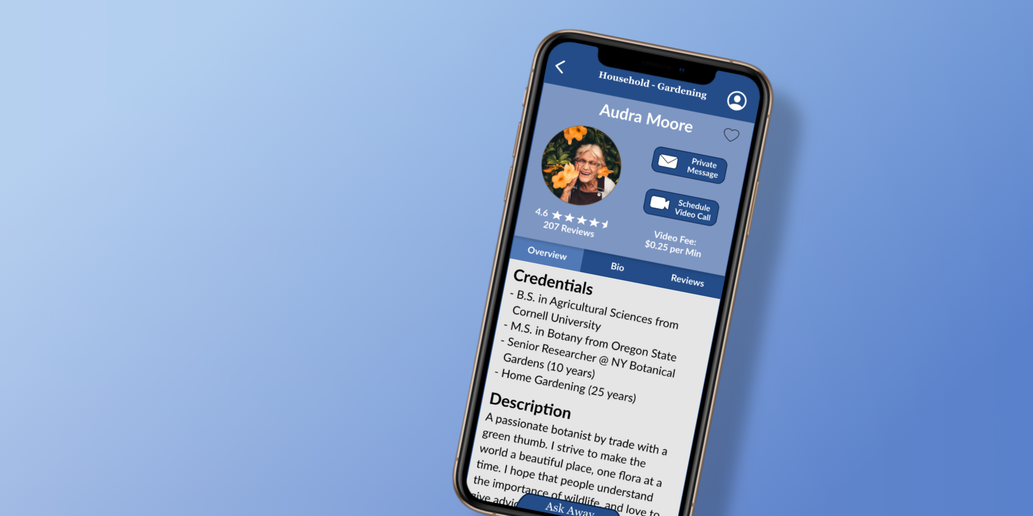
Question Chat Icon
Users mostly struggled with Task 1—Locating Question Chat and asking a question on the feature. Interviewees thought the bubble icon appeared unassuming and so didn’t think it was important. I addressed the issue by changing the form of the feature.
The new form—a tab—avoids the heuristics commonly associated with a bubble located in the bottom-right corner. Additionally, making the tab a border on the bottom clears up space on the screen that the previous iteration may have blocked.
When users located Question Chat, they were eager to enter their question right away. Users immediately skipped forward to the ‘Enter Question’ field, leaving the two before it blank. Although a minor error, this was a common one.
The simple fix was relocating the ‘Enter Question’ field to the top.
Question Chat Entry Fields
Scheduling a Call
When users were instructed to schedule a call, some clicked on the ‘Schedule’ tab instead of the ‘Schedule a Call’ button on the bottom.
I removed the ‘Schedule’ tab because it confused users, and was largely redundant. The button was also changed to read “Schedule Video Call” with a video icon; previously, users were unsure if the button enabled a phone call or a video call.
Additionally, because of the implementation of the new Question Chat tab, the CTAs for messaging and video calls had to be relocated from the bottom of the screen. These buttons were moved to the header, and the Areas of Expertise tabs were situated elsewhere to make room.
This change stemmed not from an error, but from the input of users. Some interviewees wished the Homepage had a search bar. I agreed.
This feature would be helpful for users in expediting navigation of the app. It also allowed users to forego the process of positing where their desired field would be classified among the categories.
Homepage Search Bar
I heeded the advice on the issues above and I made all the alterations proposed. The final prototype reflects these changes.
Design Systems


Final Product

Retrospection
What Went Well
User Journeys & User Flows
Defining the persona of your product is a central part of the UX process. But that’s half of the battle. Designers must also understand their users, and empathize with them. That is, to get into the mindset of the user.
I believe I did a good job in the User Journeys and Flows. In the User Flows, I imagined the prospective steps users would take to accomplish a certain task. The exercise gave me insight regarding the possible objectives of the users within the app, and how I might structure the platform. As for the User Journeys, I captured the quest and ensuing sentiments of my users. I was thorough with my work, and quite content with the outcome. More importantly, however, I considered opportunities to improve on Expert and enhance the user’s experience.
Documentation
Cataloging your work and progress is not a phase in the Design Thinking Process, nor is it a step in validating your design. Properly saving, naming, and organizing your work, however, is a highly important practice in any field, especially in a long-duration project. I kept physical copies of my work neatly in binders; I created a new version of documents when experimenting with designs; I gave documents identifiable names instead of just leaving the random, computer-generated titles. I kept my affairs orderly and systematized my files in a practical manner.
Whenever I needed to revisit work, I knew exactly where to find it. This was helpful in referring to past documents for my next steps. It also proved valuable when I was working on the case study. UX is a discipline where each step builds on the last: Documenting your work is then essential for the field. I’ve always been an organized person, but repeatedly in this case study, the habit proved to be invaluable.
User Research
I found building Expert to be a challenging task. As I said, it certainly was an enigmatic concept to begin with, so I wasn’t too sure what I was looking for. I needed the users to inform my direction when creating this cryptic platform.
With both the User Interviews and Usability Tests, I prepared scripts to guide the sessions. The formats were semi-structured: I allowed myself to veer from the script or pursue certain topics. I asked follow-up questions and sought clarification, and was rewarded with useful information. During the Usability Tests, because of the ongoing pandemic, I was forced to conduct Remote Moderated tests. Yet I was fully prepared for the tests and encountered no technical difficulties.
I have ample background in research, but little prior in UX. I am proud of how I conducted the User Interviews and Usability Tests, and the information I was able to gather from them.
What Could Have Gone Better
Early Wireframing
Throughout the case study and each of its steps, I was learning along the way. With each task, I was learning about UX through experience. That being said, I was fairly new to the field at first. This is principally evidenced in my early wireframes.
My early wireframes aren’t the prettiest. My low-fidelity wireframes seem pretty cluttered. And my mid-fidelity ones are even more so. In addition, the mid-fi wireframes had too much detail for their level of fidelity. I think I got overeager and invested too much time into detail. This effort should have been spent improving the design overall, especially considering my unfamiliarity with the software at the time.
In the future, I must focus on the purpose of each wireframe fidelity, and design accordingly. In the lower-fidelities, I should concentrate mostly on spacing, placement, relationship, and size. As I explore hi-fi screens, I can then move onto the finer details.
Linearity
As a designer, it can be difficult to conceive and construct a platform from scratch. This is even more true when you are a newcomer and the platform idea is unfamiliar to you. Considering both, I admit that I lacked confidence sometimes, and questioned my direction. I knew what I wanted the app to be, I just wasn’t positive how to render the design on-screen. I second-guessed my decisions. A few times in the early stages, I revisited my old designs, and reverted some changes. I often sought feedback from others—my mentor, tutor, and friends within the platform’s demographic. (Side note: In retrospect, I think seeking feedback was good, especially in UX). In essence, I reconsidered my design’s direction, when maybe I should have been moving forward.
I found my design process to be less linear than I initially thought it would be. I experienced some loops and bumps here and there. Maybe that is an undiscussed part of the process. Nonetheless, I need to be more confident in my designs. I can achieve this by duly evaluating them before moving on. Yet I should continue to seek feedback from others, evaluate the advice, and progress.
What I Plan to Improve
Wireframing Software
Similar to a previous point, I believe that my usage of Wireframing Software—Adobe XD—can be improved. When my project reached Digital Wireframing in Adobe XD, I was simultaneously learning how to use the tool. Much of my initial designs were limited by what I was capable of at the moment. My early designs were some of the most time-consuming.
Of course, with time I grew more comfortable with the program and became more adept at it. But I still have room to grow. For example, I can make better usage of my Components, or learn to maintain a library of colors from the start of designing. The only way to really improve is to continue using wireframing software. I fully intend to cultivate my skills in and knowledge of the programs.
Tools:
Adobe XD, Adobe Photoshop, OptimalSort, UsabilityHub, Google Forms, Skype